Scenic Designer & Art Director
Life and Trust
Art Director & Details Designer
Life and Trust is the largest immersive theatre piece New York has seen. An American adaptation of Faust set on the eve of the great crash of 1929, written by Jon Ronson, directed by Teddy Bergman and produced by the producers of Sleep No More. The set spans 6 floors of the iconic Farmers Trust Building at 20 Exchange Place in Manhattan, a 57-story Art Deco building in the heart of the financial district.
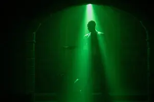
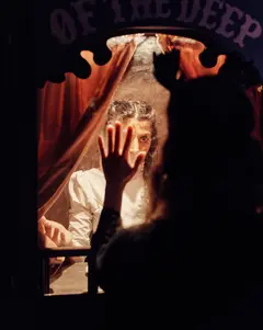
Our show starts in the banking branch in the 1920’s, then the audience take a jump into a fever dream of the 1890’s where they are left to roam freely through the expansive set. Certainly this is a place and time that has been well documented on screen, through films including The Age of Innocence and Gangs of New York, but this was a unique opportunity to immerse the audience members in the period and to witness the story unfold around them. As it is a non-verbal immersive dance piece the set and details are extremely important in telling the story; the set needs to act as a character itself. Each space has a story to tell and as you are quite often alone in a space the set needs to hold up as an immersive and engaging experience even when the performers aren’t there.
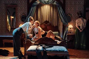
I started as one of three Scenic Designers, alongside Gabe Evansohn & Grace Laubacher, then moved on to design the details followed by the onsite art direction during the build. We spent so much time at the start of the project researching the period of turn-of-the-century New York thinking about the most exciting spaces to include, at some point we started to understand the frame of mind at the time, and what was happening in technology and industry. The visual possibilities of the gilded age were very attractive to me, I wanted to capture the essence of 19th Century New York then work out how to recreate it in the catacombs of a 1920’s bank while keeping the world feeling big and dynamic. What I was very conscious of was that the story is very much about the rotten decay beneath the gilded surface, a thin layer of gold on the surface that masks the flaws and corruption beneath it. As a result we have opulent, decadent Gilded age interiors juxtaposed with dark and dirty streets, tenements.
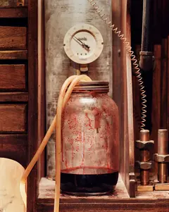
My job as Details designer and Art director was to translate the script and the director’s vision of it into a living, breathing thing. It’s not just the dressing of sets, it’s creating a complete environment around the characters to help deepen a characters story, from designing their dwelling right down to what should be in the drawer by their bedside table. I wanted to capture both the ornate architecture and the seedy underbelly of 19th century New York and immerse the audience into this iconic era but still convey a contemporary edge. I used color to help create our fever dream look and influence the mood of a space to help convey emotion and narrative. I looked at early color photography and paintings by the American Impressionists from the period and I thought of the set as a monochrome photograph of the past brought back to life through hand coloring as a fever dream. This allows the show to have the painterly quality that allowed us to use brighter colors then you may associate with the period and gives the excuse of making it more contemporary to create a unique unified look.


